
Sanzo Wada Color Combinations
-EN
When Color Moves from Intuition to System
Sanzo Wada, Color Combinations, and Conscious Design
Liking a color is easy.
Getting used to a color is easy too.
What’s difficult is explaining why that color actually works.
This is exactly where many design processes break down. Something “feels right,” but the reason it feels right remains unclear. Decisions are made intuitively, and the results are defended intuitively as well. It’s a romantic narrative—but not a sustainable one. Intuition is personal. It cannot be transferred, taught, or reliably repeated.
This is precisely the problem Sanzo Wada was addressing.His work aims to move color away from being a purely intuitive privilege and into a space where it can be thought about, discussed, and shared.

In Japan in the 1930s, color was not yet an independent field of study. There was art, craft, and aesthetics—but no separate discourse around “color combinations.” Color was learned either through tradition or through mastery under a mentor. Wada recognized something crucial: visual production was accelerating rapidly, yet there was no system to support the growing number of color decisions being made.
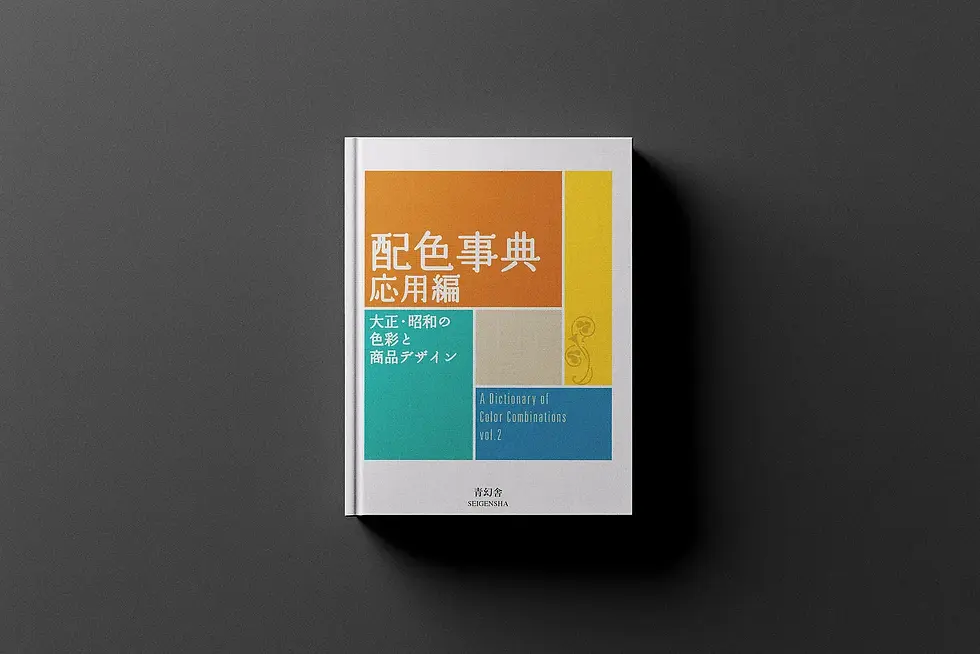
A Dictionary of Color Combinations emerges directly from this gap.
This is not an art book. It was not created to inspire in a conventional sense. It does not aim to be beautiful for its own sake. It is a tool. Rather than describing individual colors, it shows how colors behave when placed next to one another.

Here, an important mental shift takes place. Wada does not ask, “Which color is beautiful?” Instead, he asks a more fundamental question:“What happens when these colors appear together?”
The question seems simple, yet it sits at the very core of design.
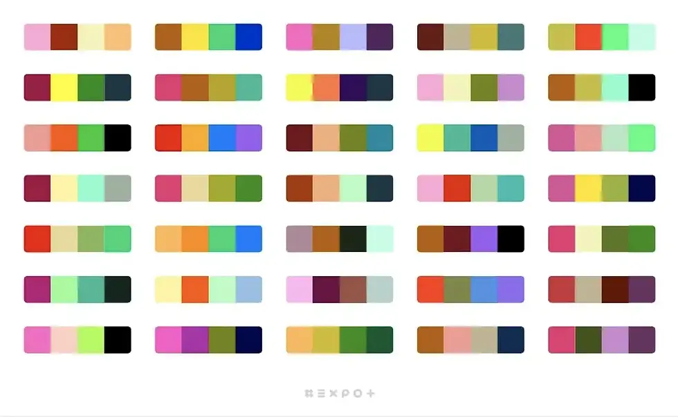
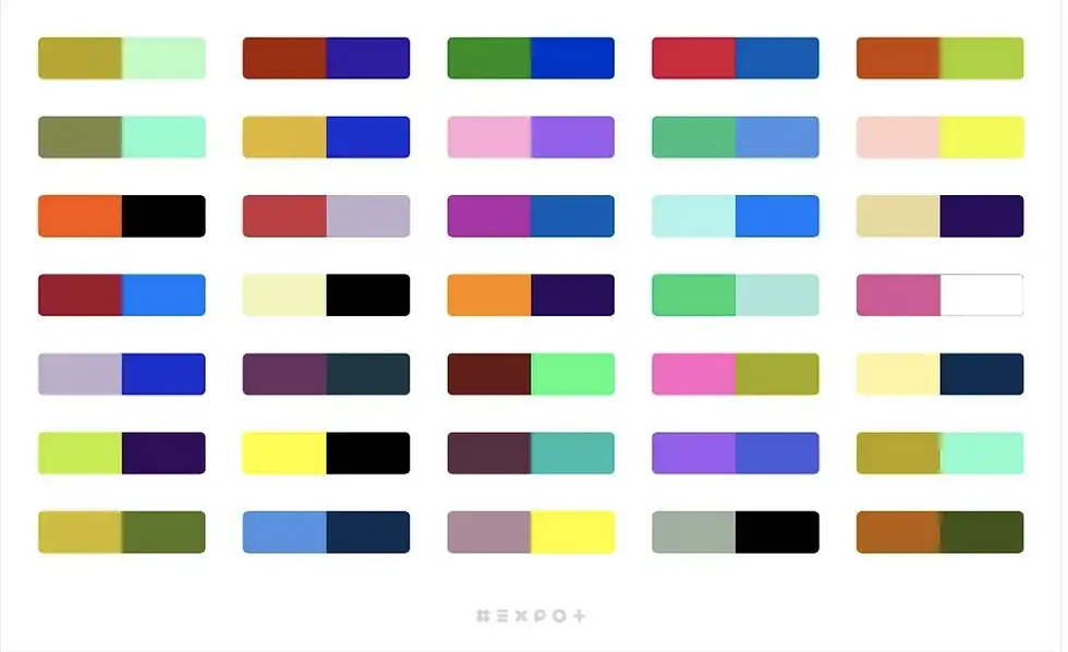
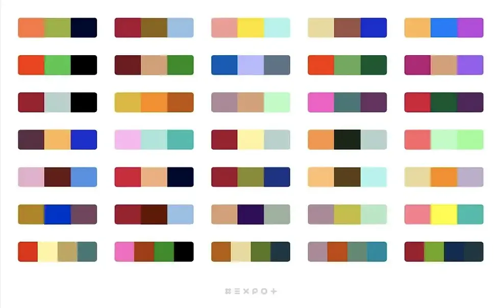
This is why the combinations in the book are organized systematically. They are grouped into two-color, three-color, and four-color structures. This is not an aesthetic preference but a perceptual one. Two-color combinations are unforgiving—balance either exists or it doesn’t. Three-color combinations build a narrative: one color leads, one supports, one recedes. Four-color combinations demand discipline; without control, visual noise quickly takes over.
Today, this logic feels familiar. We still use it in graphic design, brand identity, and interface design. But in the 1930s, this approach represented something radical: transforming intuition into a system. What Wada achieved was the creation of a repeatable decision-making framework for color.
Another key aspect of the book is that it does not limit color to the realm of fine art. Wada applied his thinking to kimono design, Western-style clothing, stage sets, cinema, packaging, and posters. Color, for him, was not decorative—it was a structural element of communication.
This perspective explains the book’s sense of timelessness. The colors do not chase trends. They do not shout in the language of their era. They are neither confined to traditional Japanese aesthetics nor blindly aligned with Western modernism. Instead, they occupy a space in between. This “in-between” quality is precisely what keeps them relevant.
When we look at these combinations today, they don’t feel nostalgic. They don’t appear outdated, because they are not rooted in a specific style period. They are grounded in the fundamentals of human perception. That is why they continue to work across packaging, digital interfaces, and living spaces alike.
The technical information added in modern editions—CMYK values and color systems—does not diminish the book’s spirit. On the contrary, it anchors it firmly in the present. These details send a clear message: this is not an archive, but a working resource. The fact that color research from the 1930s can still be translated directly into today’s digital printing standards speaks to the strength of its foundation.
Perhaps the least discussed aspect of the book is its relevance to everyday life. Wada did not see color combinations as tools reserved for professionals alone. He viewed them as guides for daily decisions—what we wear, how we shape our living spaces, how we create environments that feel balanced rather than overwhelming.
At this point, the book becomes more than a design manual. It becomes a way of thinking. Because working with color is ultimately about making choices. Not deciding what to add, but deciding what to leave out. How many colors are enough? Which one should speak, and which should step back? Which combinations calm a space, and which introduce tension?
When these questions are answered intuitively, the results may succeed—or fail. But when they are answered consciously, design becomes calmer. Noise recedes. Decisions become clearer.
For me, A Dictionary of Color Combinations is not simply a reference book; it is a threshold. A point where one is invited to rethink their relationship with color. It does not reject intuition, but it refuses to treat intuition as sufficient on its own. Instead, it supports intuition with structure, observation, and repetition.
This is where Sanzo Wada’s true legacy lies. He transformed color from a romantic talent into a learnable language. He implied that this language could be spoken by anyone. And he shifted the designer’s responsibility away from instinct alone, toward conscious decision-making.
We still open this book today not out of nostalgia, but because the need to think through color has not diminished.
If anything, it has only grown.




Comments